A brand with a dog in charge.
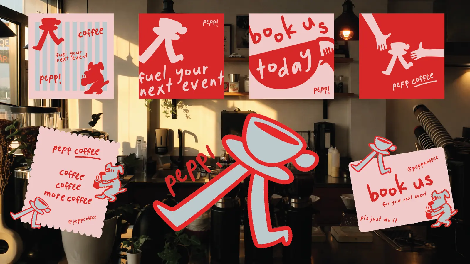
Pepp came to us with colors they loved and no logo to tie it together.
The name is short for Pepper, their dog, so we let him run the whole thing. He is the mark, the mascot and the attitude.
We kept the lettering perfectly imperfect. Hand done and full of character instead of stiff and corporate, so the brand feels personal and unmistakably theirs.
Mark
Pepper, drawn loose enough to feel hand made and simple enough to work tiny.
Lettering
Hand drawn type that keeps the slightly off feel on purpose.
System
Cups, stickers, cards and posts all pulled from the same few parts.
“I didn’t want to send my inquiry into the void and receive AI generated images. I wanted a real team I could work with. Tyson not only created beautiful graphics, but also took the time to really listen to what I was wanting and looking for. 7Fold is it.”